Before the White Cube: How Exhibition Rooms Found Their Shape
See how exhibition room layouts shifted from crowded walls to open displays, and learn to spot how spacing and sightlines shape a gallery visit.
The common mistake in an older gallery is to treat every framed work as an equal invitation to stop. On a crowded wall, that approach can turn paintings into visual noise: you scan quickly, miss the arrangement’s logic, and leave without noticing how the display directed your attention. Exhibition room layouts offer a better way to look deliberately during a weekend visit.
Think of a gallery hang as a set of choices about distance, sequence, and emphasis. A densely arranged wall invites comparisons among several works at once. A more open room gives each object breathing space and may encourage a slower encounter. Neither arrangement is neutral or automatically better. The useful question is what the room asks you to notice.
Crowded wall displays
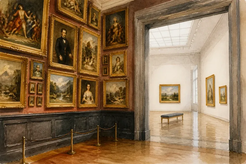
For a long period, European exhibition rooms commonly displayed many paintings together, sometimes in rows that climbed from near eye level toward the ceiling. This arrangement is often called a salon hang. The name refers to a format associated with large public exhibitions, not to one precise style of room or a single set of rules.
In a salon hang, the wall becomes a field of comparisons. A small canvas may sit near a large one; portraits, landscapes, and historical scenes can share a vertical plane. Your gaze moves sideways and upward, choosing a route rather than following a prescribed sequence. Frames separate each picture from its neighbors, while the crowded field makes relationships visible.
This layout can reward a visitor who looks for contrasts: a dark image beside a pale one, a formal portrait near a landscape, or repeated subjects at different heights. It can also make close inspection difficult. Works placed high on the wall may be harder to study, and a packed arrangement gives each image less visual quiet.
Say you arrive alone at a gallery with a wall of closely spaced paintings. You first notice the largest canvas, then spot a smaller portrait at its edge whose color echoes a landscape below. You follow that visual connection instead of trying to inspect everything. The expected result is a clearer sense of how the grouping guides your eye, not a complete account of every work.
Room hierarchy
A dense display does not mean every work has the same status. Position, scale, framing, and the direction of your approach can establish a hierarchy. A prominent central image may serve as an anchor; a doorway can frame a particular work before you enter. A broad, uninterrupted wall may draw attention simply because it is easy to see from across the room.
Look at the display from the threshold before moving closer. Which object becomes legible first? Does a central work dominate, or does your eye travel along a row? Then notice whether labels, benches, or barriers alter your route. These details shape the viewing experience, even when they are not artworks.
Distinguish the room’s original arrangement from a later interpretation. Galleries change displays, and a historic building may now contain a contemporary installation. A room can evoke the density of an older hang without reproducing a particular exhibition exactly. A label or gallery note may explain the curatorial approach. If it does not, describe what you can observe rather than guessing at historical intention.
Space between works
Over time, many exhibition settings shifted toward fewer works per wall and greater separation between objects. The change was gradual, varied by institution, and shaped by more than taste. Collecting practices, conservation, lighting, architecture, and the presentation of individual artists all affected how works could be shown.
Open display changes the pace of looking. A painting with clear space around it can command attention from farther away. Visitors may approach it alone rather than compare it immediately with nearby pictures. The wall becomes less like a visual field and more like a sequence of individual encounters.
That separation can help you attend to scale, surface, and detail. It may also hide relationships that a crowded hang makes easy to see. When works are dispersed across several rooms, you must carry comparisons in memory or notice how the curator links them through sightlines, labels, or recurring subjects. Open space does not remove interpretation; it changes where it happens.
One familiar label for the bright, uncluttered gallery is the “white cube.” The term describes an exhibition ideal: pale walls, restrained surroundings, and works presented as if they can be considered apart from everyday life. Actual galleries vary. Some have colored walls, visible windows, historic decoration, or flexible partitions. Even a plain room is shaped by lighting and the route through it.
Reading exhibition room layouts
During a weekend visit, use a few observations to see how exhibition room layouts guide attention. At each point, let what you observe determine your next move:
- At the entrance: Check which work first catches your eye and whether the doorway frames it. If one object dominates, move closer to inspect it; if the view feels scattered, scan the wall for a cluster or repeated subject.
- Across the wall: Check for clusters, empty gaps, repeated heights, and changes in scale. If several works seem linked by subject or color, compare them; if gaps separate the pictures, give each one a closer look before searching for connections.
- At eye level: Check which works meet your gaze naturally and which sit above or below. If a picture at eye level holds your attention, approach it; if a higher or lower work catches your eye, find a permitted viewing position rather than stretching or crossing a barrier.
- From farther back: Check whether a central object, long sightline, or neighboring room becomes prominent. If the wider view reveals a clear relationship, follow it; if it does not, return to a nearer view of one work.
- Near a label: Check the text after looking at the work. If it clarifies a grouping or display choice, use that context to look again; if it does not address the arrangement, stick to what the spacing and placement visibly show.
- At the exit: Check which works remain visible together and whether the view makes a new connection apparent. If it does, carry that comparison into the next room; if it does not, leave without forcing a link.
Adapt these prompts to the room. Keep clear of others, follow gallery signs, and do not cross barriers to get a better angle. A busy space may call for a quick glance rather than a long pause. It is not worth trying to identify the exact historical model behind every wall or assign a fixed meaning to every gap. A room may have been rearranged, adapted for a loan, or shaped by practical limits you cannot see; speculation can distract from the visible evidence of spacing, placement, sightlines, and movement.
Questions about gallery layouts?
What is a salon hang?
A salon hang is a dense display in which many pictures occupy a wall, often at several heights. It makes comparisons among works easy to notice, while giving some individual pieces less space.
Why are some galleries so open?
Open displays can focus attention on individual works and provide room to view them from different distances. Their appearance also reflects curatorial choices, building design, conservation needs, and the kind of exhibition being presented.
Does a white cube have white walls?
Often, but the term points to more than paint color: it describes a restrained setting that minimizes visible distractions around the art. A gallery can use pale walls without following that ideal in every other respect.
Which layout suits a short visit?
Neither layout is always better. A dense wall offers several comparisons at a glance, while an open room can make one work easier to approach; choose the pace that suits your attention and the room’s conditions.
Attention at the threshold
On your next arts stop, spend a moment at the threshold before choosing a favorite work. Notice what the room shows you first, then decide where to look next. The history of exhibition room layouts becomes less abstract when you can see the answer in the wall in front of you.